












- Details
- Categorie: Pages
Typography
Documentation and examples for Bootstrap typography, including global settings, headings, body text, lists, and more.
h1. Heading 1
h2. Heading 2
h3. Heading 3
h4. Heading 4
h5. Heading 5
h6. Heading 6
Display 1
Display 2
Display 3
Display 4
Display 5
Display 6
This is a lead paragraph. It stands out from regular paragraphs.
You can use the mark tag to highlight text.
This line of text is meant to be treated as deleted text.
This line of text is meant to be treated as no longer accurate.
This line of text is meant to be treated as an addition to the document.
This line of text will render as underlined.
This line of text is meant to be treated as fine print.
This line rendered as bold text.
This line rendered as italicized text.
Alerts
Provide contextual feedback messages for typical user actions with the handful of available and flexible alert messages.
Badge
Documentation and examples for badges, our small count and labeling component.
Example heading New
Example heading New
Example heading New
Example heading New
Example heading New
Example heading New
Example heading New
Example heading New
Buttons
Use Bootstrap’s custom button styles for actions in forms, dialogs, and more with support for multiple sizes, states, and more.
Card
Bootstrap’s cards provide a flexible and extensible content container with multiple variants and options.
Card title
Some quick example text to build on the card title and make up the bulk of the card's content.
Go somewhereCard title
This is a wider card with supporting text below as a natural lead-in to additional content. This content is a little bit longer.
Last updated 3 mins ago
Card styles
Cards include various options for customizing their backgrounds, borders, and color.
Primary card title
Some quick example text to build on the card title and make up the bulk of the card's content.
Secondary card title
Some quick example text to build on the card title and make up the bulk of the card's content.
Success card title
Some quick example text to build on the card title and make up the bulk of the card's content.
Danger card title
Some quick example text to build on the card title and make up the bulk of the card's content.
Warning card title
Some quick example text to build on the card title and make up the bulk of the card's content.
Info card title
Some quick example text to build on the card title and make up the bulk of the card's content.
Light card title
Some quick example text to build on the card title and make up the bulk of the card's content.
Dark card title
Some quick example text to build on the card title and make up the bulk of the card's content.
Progress
Documentation and examples for using Bootstrap custom progress bars featuring support for stacked bars, animated backgrounds, and text labels.
Spinners
Indicate the loading state of a component or page with Bootstrap spinners, built entirely with HTML, CSS, and no JavaScript.
Pagination
Documentation and examples for showing pagination to indicate a series of related content exists across multiple pages.
- Details
- Categorie: Pages
Bij al de template layouts is de code aangepast zodat als er alleen een intro image gekozen wordt deze ook als full article image getoond wordt.
Bij de 'default from component' layout wordt de intro image enkel getoond in overzichten, als het artikel geopend wordt wordt enkel de full article image getoond, niets dus als er enkel een intro image is..
Layout 1
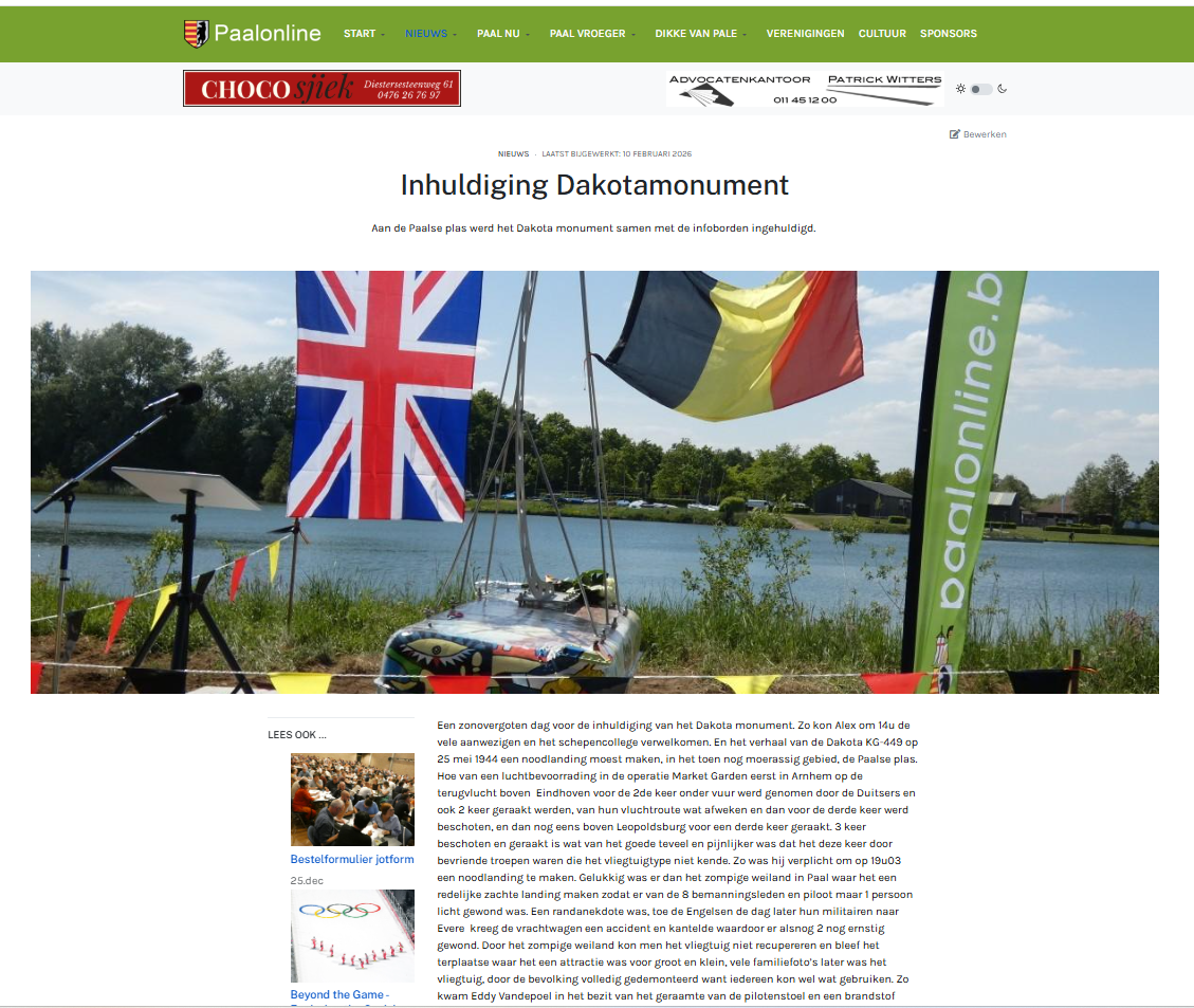
Layout 2
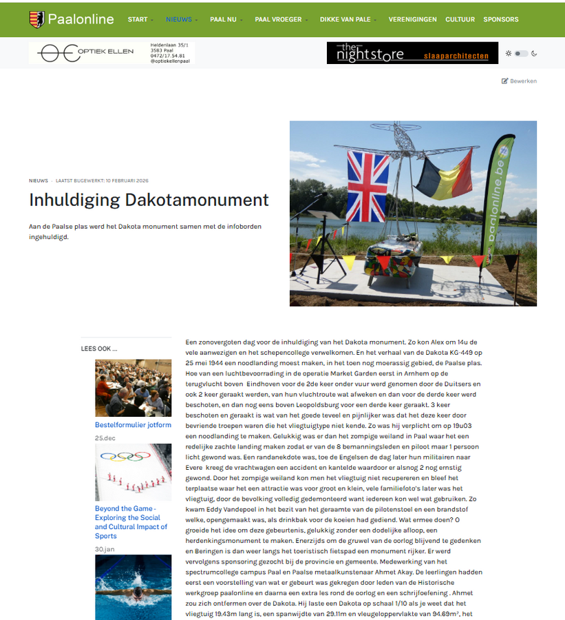
Layout 3 (idem als layout5 maar zonder leesook zijbalk)
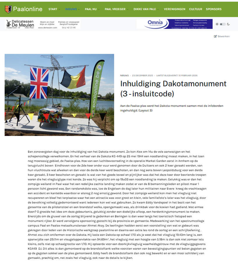
Layout 3 ingesteld voor foto's van vroeger - dorpsleven
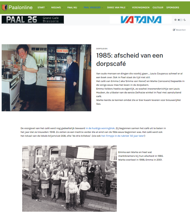
Layout 4 (leesook balk links - gebruik bij voorkeur layout5 met leesook rechts)
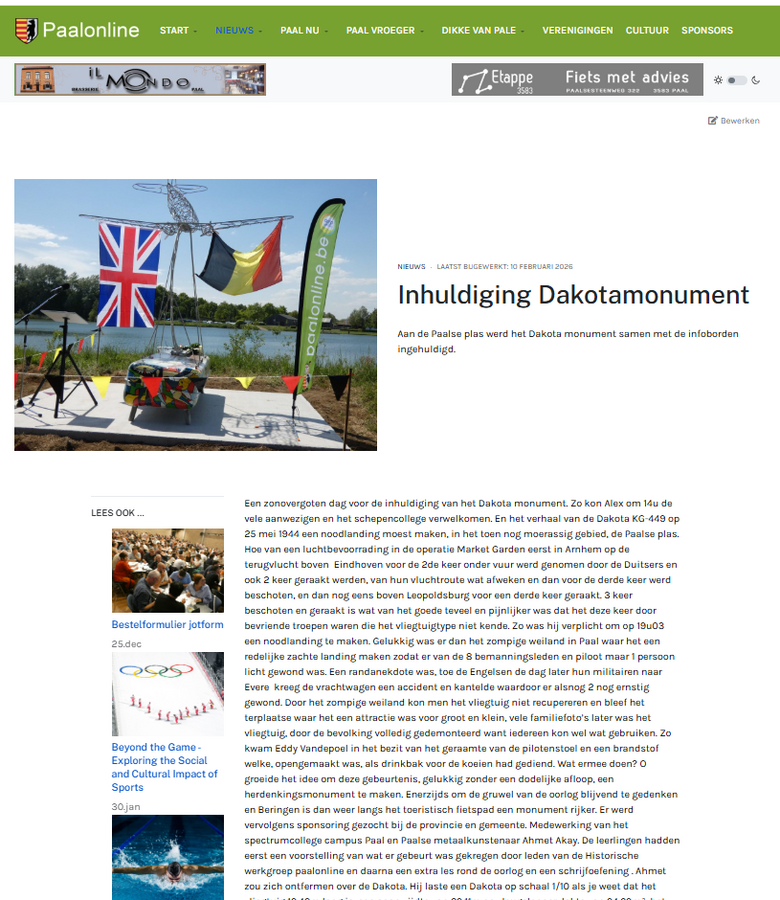
Layout 5 - default layout ingesteld bij 'artikels' en bij menu nieuws
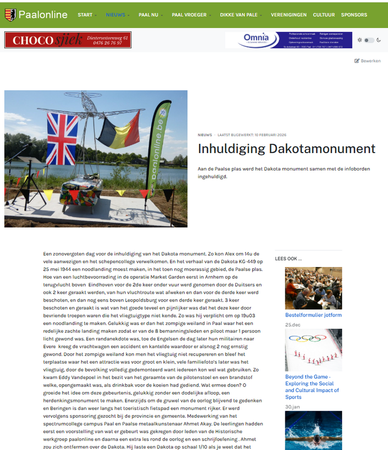
Layout 6 (met intro-image - let op foto=breed, boven en onder afgeknipt)
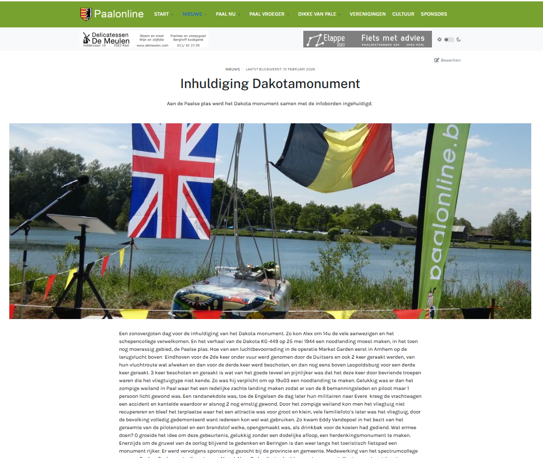
Layout 6 (zonder intro-image)
Default from component
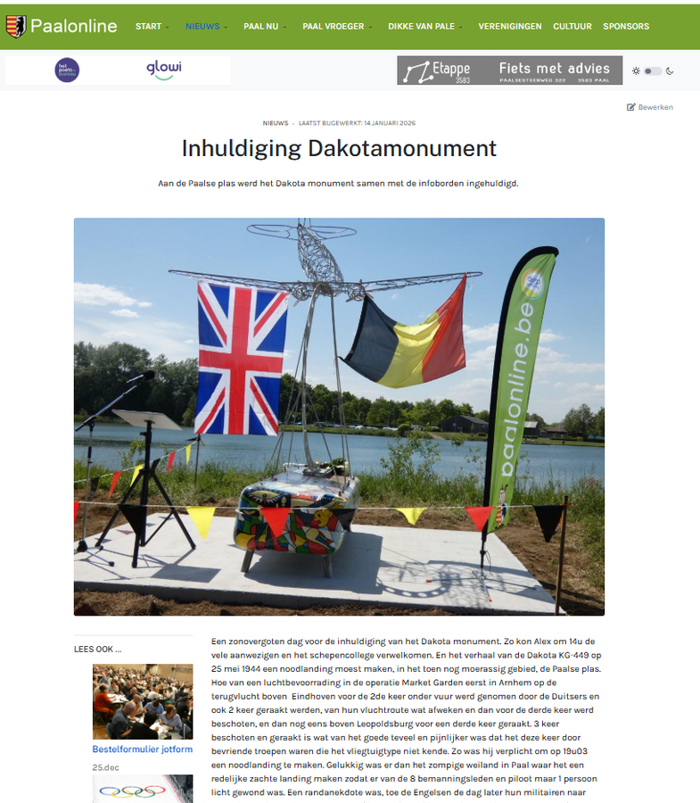
Layout 7 (foto even breed als tekst, geen zijbalken)
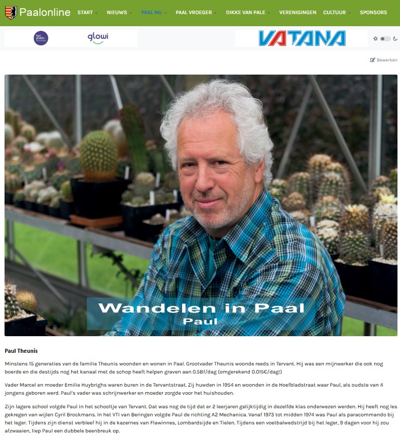
Default from component - default ingesteld voor filmpjes van vroeger
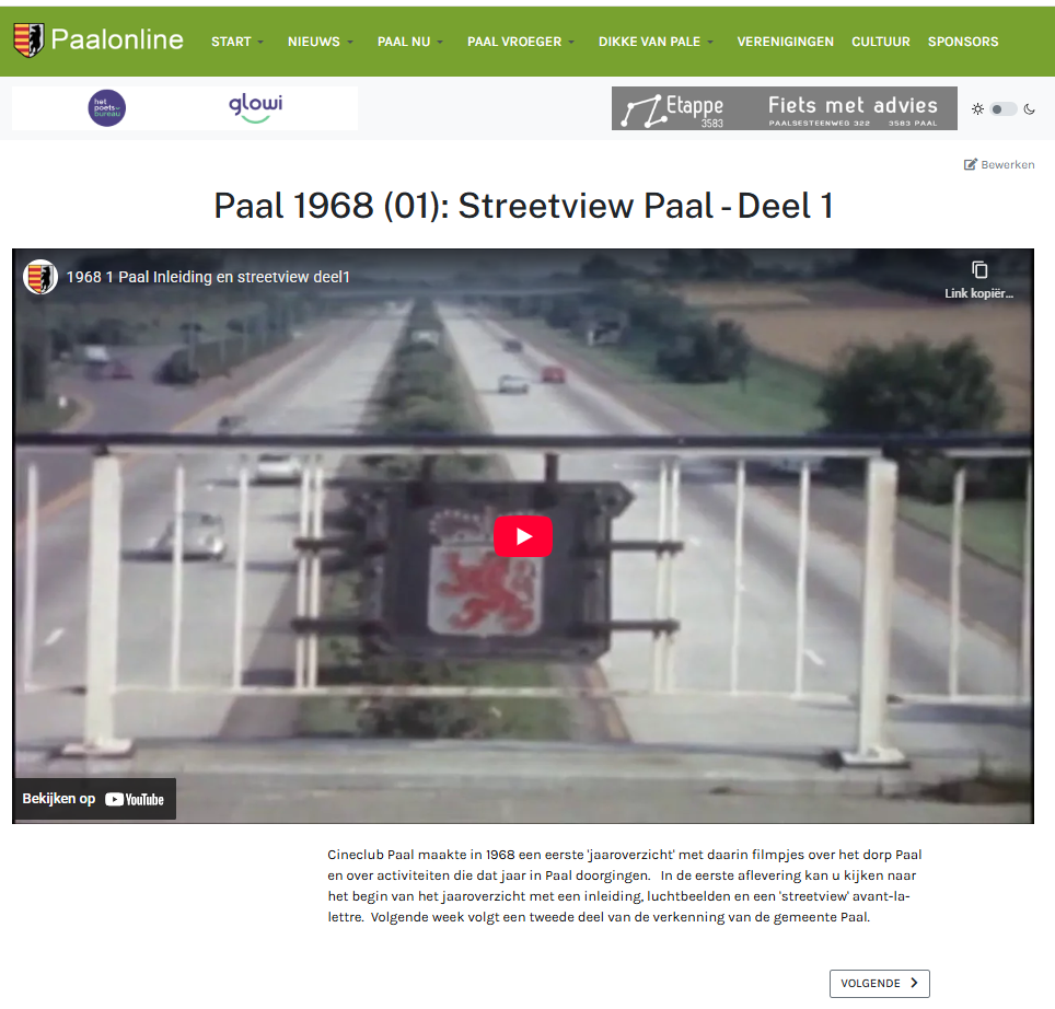
Layout 6 - voorkeur voor artikels waarin filmpje centraal staat.
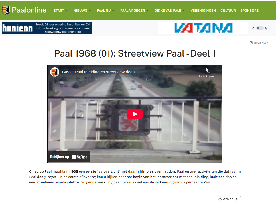
x
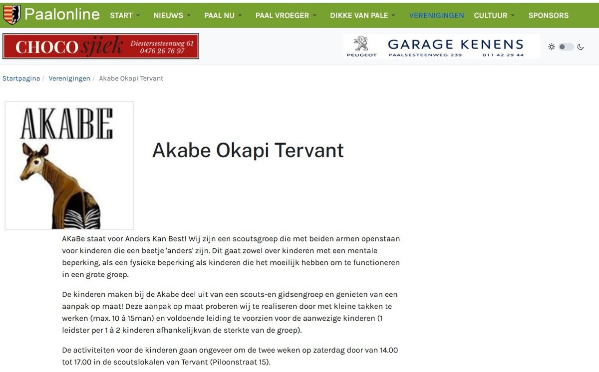
Layout 8 - idem layout 3 maar met kleinere afbeelding (verenigingen)
Zoek op Paalonline
Binnenkort in Paal
| 08 nov 2026 08:00 - 17:00 Kampmenu Scouts en Gidsen Tervant |
| 09 nov 2026 19:30 - Stoelyoga OC de Buiting |
| 11 nov 2026 10:00 - 16:30 Wandelend Paal Clubwandeling |
| 13 nov 2026 19:00 - Palarte: Vernissage |
| 13 nov 2026 19:00 - Vernissage palarte overzicht kunstenaars |
| 14 nov 2026 10:00 - 18:00 Tentoonstelling palarte |
| 14 nov 2026 10:00 - 18:00 Tentoonstelling palarte overzicht kunstenaars |
| 15 nov 2026 10:00 - 18:00 Tentoonstelling palarte |
| 15 nov 2026 10:00 - 18:00 Tentoonstelling palarte overzicht kunstenaars |
| 15 nov 2026 11:00 - Paal op de Pedalen ! |
Internetgazet Beringen
Het nieuws uit Beringen-
Monsterscore voor Beringen FC
BERINGEN - Beringen FC is vanmiddag met 1-7 gaan winnen op het veld van FC Bolderberg. Zaterdag 14 november ontvangt Beringen FC FC Anadol B.
-
G-voetbalteams KFC Paal-Tervant in actie
BERINGEN - "Maar bij G-voetbal zijn de uitslagen niet het belangrijkste. We streven vooral naar een gelijkwaardig wedstrijdverloop, zodat alle spelers plezier beleven en frustraties of teleurstellingen zoveel mogelijk (...)
-
Nieuwe locatie Esra
BERINGEN - Voor wie houdt van een lekkere kebab of een andere Turkse specialiteit is eethuis Esra in Koersel al jaren een vertrouwde stek. Nu zijn ze te vinden in een volledig vernieuwd pand aan het rondpunt in het (...)
-
Nieuw pand voor Thai King Kaw
BERINGEN - Thai King Kaw is in Koersel ook al jaren een begrip op het gebied van Thaise keuken en sushi. Ze hebben nu een nieuw pand gevonden in de Pieter Vanhoudtstraat 30. (foto Patrick Cosemans)
-
Snowling en meer
BERINGEN - Wat doe je op een druilerige herfstavond? Spelletjes spelen is altijd een goed idee. Daarom organiseerde Play-ER in Beverlo gisterenavond een dubbel combi-tornooit waarbij duo’s streden in (...)


De Dikke van Pale - Cursiefjes en Böetingse les


